




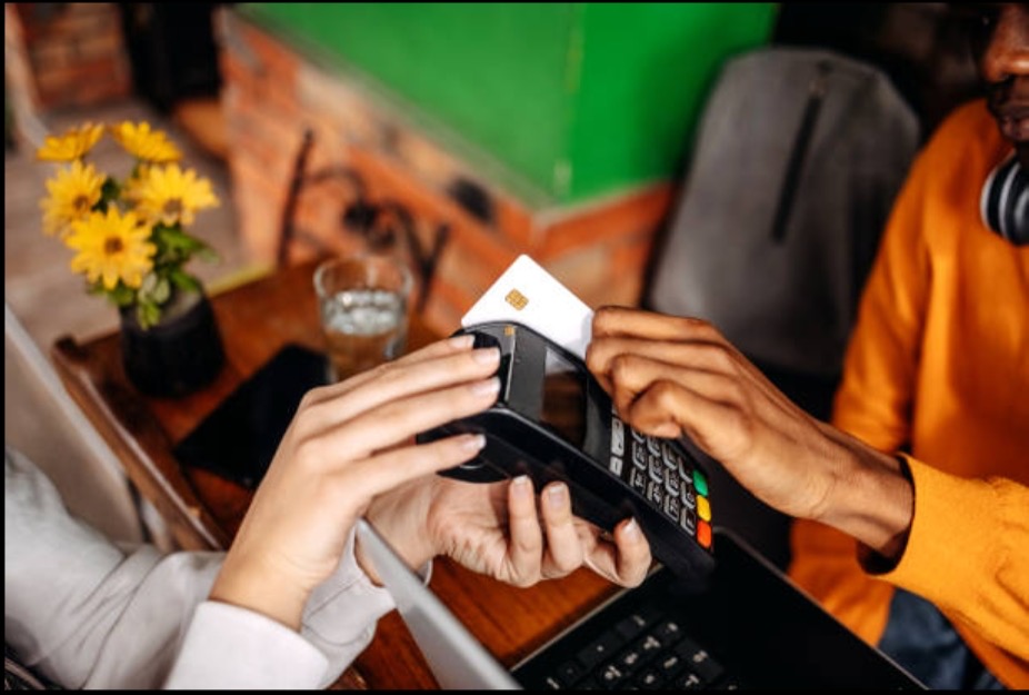
Think about the last time you met someone new. You smiled, said hello and shared your details. That small moment can shape how they feel about you and your business.
A Digital Business Card makes that moment smooth and memorable. Yet the way your card looks and feels matters just as much as the details inside it. This is what experts call user experience, or UX for short.
When the experience is lovely, people enjoy opening your card, finding what they need and saving your details. In this guide, you will discover friendly, practical ways to improve the user experience of your Digital Business Card. Each idea is simple, and you can start using many of them today.
What Is User Experience?
User experience is how a person feels when they use something. It covers how easy it is to understand, how pleasant it looks and how quickly it helps them reach their goal.
Imagine walking into a well-organised shop. The signs are clear, the shelves are tidy and the staff are welcoming. You find what you need in moments, and you leave with a smile. That is great user experience.
Your Digital Business Cards can offer the same comfort. A visitor opens it, sees who you are, taps a button and connects with you. Every step feels natural. When the journey is that smooth, people remember you fondly.
Why a Great Experience Matters
Your card is often the first thing people see of your brand. A clear, friendly design tells them that you are professional, thoughtful and ready to help.
A pleasant experience also encourages action. When your phone number is easy to find, people call you. When your booking link is simple to tap, they book a meeting. When saving your contact takes one touch, they keep you in their phone for good.
Good experience builds trust too. People enjoy dealing with businesses that make life easier, and a well-made card is a lovely first example of that care.
Begin with a Clear Goal
Every great card has a main purpose. Ask yourself what you would love visitors to do first. Perhaps you wish them to call you, visit your website, book a meeting or save your contact.
Once you know your main goal, you can place it at the top of your card in a bright, clear button. Other details can follow in a calm order beneath it.
A helpful tip is to choose one main action and two or three supporting actions. This keeps the card focused and easy to enjoy. Visitors then know exactly where to tap.
Keep the Layout Simple and Tidy
A tidy layout is a gift to the reader. It lets the eye travel smoothly from top to bottom, and it makes every detail easy to find.
Here is a pleasant order to follow:
- Your photo or logo
- Your name and job title
- A short, friendly introduction
- Your main action buttons, such as call, email and save contact
- Links to your website and social pages
- Extra details, such as services, reviews or location
Use plenty of white space. Gentle gaps between sections give your content room to breathe. Group similar items together, so people can understand your card at a glance.
Aim for one clear column on mobile screens. Phones are narrow, and a single column lets people scroll naturally with one thumb.
Make Your Card Load Quickly
Speed is a big part of a happy experience. People enjoy cards that open in a blink, especially when they are standing at an event or walking between meetings.
Here are some easy ways to keep your card quick:
- Resize your images. A profile photo of around 500 pixels wide is plenty. Smaller files open faster.
- Choose modern formats. Formats such as WebP keep pictures crisp while staying light.
- Keep videos optional. Place a video behind a friendly “Watch my story” button, so people choose when to play it.
- Limit extra add-ons. Each added tool or widget needs a little time to load. Keep only the ones that truly help.
You can test your speed using free tools such as Google PageSpeed Insights. They offer simple suggestions for making your card even faster.
Design for Mobile First
Most people open a Digital Business Card on a phone. So it makes sense to design for the small screen first, and then let it grow nicely onto tablets and computers.
Make buttons large enough for a thumb. A size of about 44 by 44 pixels feels comfortable. Leave a little space around each button so every tap lands where the person intends.
Place key actions within easy reach of the thumb. Many people hold their phone in one hand, so buttons near the middle or lower part of the screen feel natural.
Test your card on different phones and screen sizes. A card that adapts beautifully to each one gives everyone a smooth experience.
Choose Colours and Fonts That Feel Like You
Colours and fonts give your card its personality. They also guide the eye and make reading easier.
Pick two or three main colours and use them consistently. Your brand colours are a lovely place to begin. Choose one bright shade for important buttons, so they stand out clearly.
Keep a strong contrast between text and background. Dark text on a light background is a timeless favourite, and it is easy on the eyes in sunshine and indoors.
For fonts, choose clean, friendly styles such as Open Sans, Lato or Roboto. Use one font for headings and one for body text. A comfortable size of 16 pixels or more for main text keeps everything easy to read.
When your colours and fonts work together, your card feels polished and welcoming.
Write Clear and Friendly Words
The words on your card are just as important as the design. Short, simple sentences help people understand you quickly.
Try writing as you would speak to a new friend. A line such as “Hello, I am Priya. I help families find their dream homes” is warm, clear and memorable.
Give each button a helpful name. Labels like “Call me”, “Book a free chat” and “See my work” tell visitors exactly what will happen next. Clear labels create confidence and encourage more taps.
Keep your introduction brief. Two or three lines are plenty. Visitors can explore more through your links if they wish.
Use Images and Video Wisely
A friendly photo helps people connect with you. Choose a clear, well-lit picture where you are smiling. A natural, warm photo says more than a long description.
If you have a logo, place it near the top, so your brand is easy to spot. Keep other images purposeful, such as product photos or a short portfolio.
Add short descriptions, called alternative text, to every picture. This helps people who use screen readers, and it also supports search engines.
Short videos can add a lovely personal touch. A twenty-second welcome message or a quick product demo can bring your card to life. Keep videos brief and let visitors press play when they are ready.
Make Saving Your Contact Effortless
The most valuable moment for your card is when someone saves your details. So make that step as easy as possible.
Add a clear “Save contact” button near the top. When tapped, it should place your name, number, email and website straight into the person’s phone book.
A “Share my card” button is also helpful. It lets your new contact pass your details to a friend or colleague in seconds.
Consider adding a short form where visitors can leave their own details. This lets you follow up with a friendly message and keeps the conversation going.
Offer Easy Ways to Share
A great experience includes how your card reaches people. Offer a few simple routes, so each person can choose their favourite.
- QR code. Display it clearly on your badge, stand, brochure or email signature. Make it large, with a calm border around it.
- Tap to share. Cards with NFC let people tap phones together for an instant share.
- Short link. A tidy link, such as yourname.com/card, is easy to type, read aloud or paste into a message.
- Email or text message. Send your card straight to someone’s inbox, ready to open at their leisure.
Before a big event, test your QR code on a few different phones. A quick check helps you share with confidence.
Keep Your Details Fresh
People enjoy finding accurate, up-to-date information. Review your card regularly to make sure every detail is correct.
Check your job title, phone number, website links and social pages. Update your photo from time to time. Add new services, awards or special offers as they arrive.
One of the lovely things about a Digital Business Card is that updates appear instantly. People who saved your link always see the latest version, so your card stays useful for years.
A short note such as “Currently offering free consultations this month” can also add a seasonal sparkle.
Welcome Everyone
Great experience means a warm welcome for all. When your card is easy for everyone to use, more people can connect with you.
Choose strong colour contrast and readable text sizes. Add alternative text to images. Label buttons clearly so screen readers can speak them aloud. Offer your card in the languages your audience speaks, with a simple language switch near the top.
These small touches show care, and they make your Digital Business Card a pleasure for people of every age, background and ability.
Add Gentle Touches of Delight
A few thoughtful details can make your card feel special. Try a warm greeting that changes with the time of day, such as “Good morning”. Add a soft hover effect on buttons, so they respond when touched.
A short testimonial from a happy customer can bring a smile and build trust. A friendly closing line, such as “Lovely to meet you”, leaves a warm final impression.
Keep these touches light and tasteful. They should add charm while keeping the card quick and clear.
Learn from Real Feedback
The best way to improve is to listen. Ask friends, colleagues and customers to try your card and share their thoughts.
You might ask:
- Was it easy to find my phone number?
- Did the buttons feel comfortable to tap?
- Did the card load quickly?
- Was there anything you wished to see?
Many card platforms also offer simple analytics. These show how many people viewed your card and which buttons they tapped most. If your booking button receives plenty of taps, you might move it higher. If a link receives few taps, you might rename it or place it somewhere new.
Small, regular improvements add up to a wonderful experience over time.
A Quick Checklist
Keep this handy list beside you as you polish your Digital Business Card:
- A clear main goal and one bright main button
- A tidy, single-column mobile layout
- Fast loading images and light pages
- Strong colour contrast and readable fonts
- Friendly, simple words and clear button names
- A one-tap save contact button
- Several sharing options, including QR code and link
- Fresh, accurate details
- Accessibility features for every visitor
- Regular feedback and small improvements
Final Thoughts
A Digital Business Card is a friendly handshake in digital form. When the experience is smooth, clear and welcoming, people enjoy every step, from opening your card to saving your details.
Start with your main goal, keep your layout tidy and let your personality shine through colours, words and images. Make your card quick, easy to share and open to everyone. Then listen to feedback and keep improving.
You do not need to change everything at once. Choose two or three ideas from this guide and try them this week. Before long, your Digital Business Card will be a delightful tool that helps you make lasting connections.
Frequently Asked Questions
What is user experience in a Digital Business Card?
User experience is how easy, pleasant and helpful your card feels to visitors. It includes the layout, speed, colours, words and the simplicity of tapping buttons and saving your details.
How can I make my Digital Business Card load faster?
Resize your images, use modern formats such as WebP, keep videos optional and include only the tools you truly need. Free speed checkers can show you further ways to improve.
What should I place at the top of my Digital Business Card?
Begin with your photo or logo, your name, your job title and a short welcome line. Follow these with your main action buttons, such as call, email and save contact.
How many buttons should my card have?
One main button and two or three supporting ones work beautifully. This keeps your card focused and makes each choice clear and simple.
Can I improve my Digital Business Card after sharing it?
Absolutely. Updates appear instantly, so everyone who saved your link sees the latest version. You can refresh your photo, add new services or adjust your buttons whenever you wish.
How do I know if people enjoy my Digital Business Card?
Ask for feedback from friends and customers, and check the analytics on your card platform. Views, taps and saved contacts show you what people love most.